
News
2026.07.27 (Monday)
J. F. Oberlin University New logo for the Ekiden team decided!
J. F. Oberlin University The Ekiden team, which had been working on a new logo aimed at enhancing the team's brand value, has now been decided.
This project was carried out over about three months with the cooperation of Professor Konishi from College of Performing and Visual Arts and students from Konishi's seminar. Beyond just design creation, we carefully incorporated the team's philosophy, appeal, and team spirit into the design through interviews with athletes and staff, practice observations, and multiple presentations.
A final presentation was held for the completed design proposals, followed by a collective vote by the ekiden team members. The logo, expressing J. F. Oberlin University character through a gradient of yamabuki color and red fat, was chosen to enhance practicality, friendliness, and team unity.
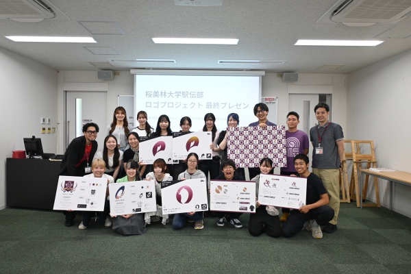 The final presentation
A design that expresses the essence of J. F. Oberlin University
The new logo features a highly visible design featuring the gradient of 'Yamabuki color' and 'Enji,' symbolizing J. F. Oberlin University.
The motif combines three elements: the initial letter 'O' for Obirin, the cherry blossom symbolizing the university, and the 'tasuki' (sash), an essential part of ekiden competitions. J. F. Oberlin University At a glance, the team expresses its identity as a symbol that recognizes the ekiden club.
The new logo will be used in various situations, including the official Ekiden team's social media, various promotional materials, and original merchandise.
Through this logo, we aim to share the appeal of the J. F. Oberlin University Ekiden Club with more people, deepen our connections with our supporters, and enhance the team brand.
We appreciate your continued warm support for the J. F. Oberlin University Ekiden Team.


Inquiry
桜美林学園 総合企画部 広報課
webadmin@obirin.ac.jp




